Easy Solutions for 5 Very Common UX Mistakes
I’ve been designing and using digital interfaces for well over two decades. In that time I’ve seen a handful of mistakes that we keep making, over and over again. They’re the UX faux pas that I love to hate. 5 of them, in particular, are especially egregious. Let’s avoid all of these at all times.
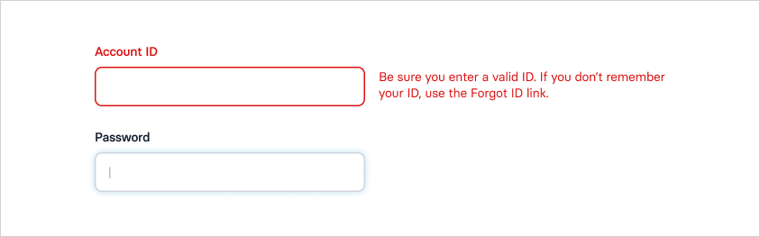
1. Authentication labels (log/sign, in/on, out/off)
This one’s a banger. Look closely and you’ll see it everywhere.
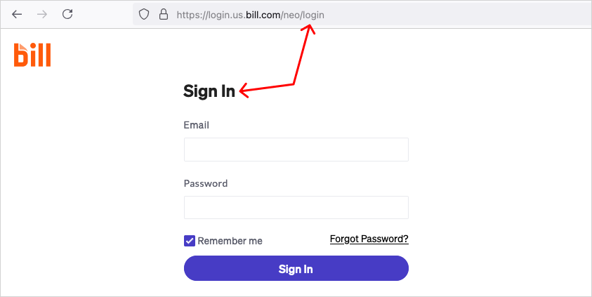
Login vs. log-in: these two phrasings are different, and should be treated accordingly. “Login” is a noun that represents a location, such as a “login page.” “Log-in” is a phrasal verb that represents the act of logging in, such as “log-in below.” These same rules also apply to the process of signing up, used as “signup” and “sign-up.”)
In/out vs. on/off: consistency is important. Once you’ve logged in you can’t log off, and vice versa. You either log in and then out, or on and then off.
Log vs. sign: again with consistency. It is more common to log in than sign in, but either is acceptable. What’s important is that once someone has logged in they should not be asked to sign out.
Log vs. sign vs. in/out vs. on/off: finally, you can never, ever log in then sign off. The process of authentication is not a square dance, a quilt, or a cocktail. You log or sign, in and out, or on and off.
Solution
Get everyone on the same page with a clear taxonomy. If creative, writing, and engineering teams are all referencing the same classification system, labeling will be consistent.
2. Shaming people for opting out
Auto-launching modal windows are quite common, but they always disrupt the flow in UX because they force people to disengage from the task at hand. Most of the modals ask people to sign up for an email newsletter or engage in a live chat.
These modals, which have become quite common, include language intended to be clever or humorous. But the end result most often focused on shaming people into submission.
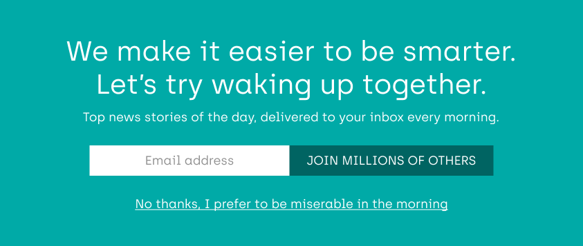
Don’t assume that your newsletter is the key to someone’s happiness. Their mornings may actually be awesome, even if they’ve never subscribed to your list.
Solution
A simple “no thank you” is perfect. But if you want to be clever, do so with kindness. Shame and belittling is never the answer.
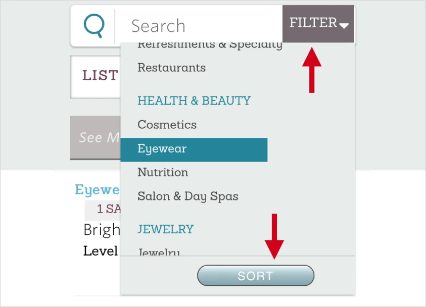
3. Using “filter” and “sort” interchangeably
Filtering and sorting are two completely different interactions. Filtering uses deduction to condense a list of items, while sorting simply reorders them. This should be simple, but people get it wrong all the time. And often they’re mixed together in the same view.
Solution
Understand the difference. Use one, the other, or both. Just use them correctly: sort to change the presentation order and filter to remove items.
4. Premature form validation
At some point, someone realized that a hint of javascript could be used to validate a web form before submission, in real time. Client-side validation has pros and cons, which I won’t get into here. What I will note, however, is that if we’re going to validate on the client side, we need to do it correctly. That means not validating before people enter a value into a field (on focus). It means waiting until after they have exited the field (on blur).
I often complete data entry for a field, tab to the next, then — BAM! — an error appears. What exactly is being validated if there’s no data? We have to stop doing this to people. It’s confusing. And startling.
Solution
It’s okay to use client-side validation. But please do so with integrity, by validating on blur rather than on focus.
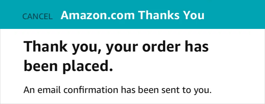
5. Using the label “cancel” to close a view
The word “cancel” has an explicit meaning in UX: “I do not want to complete this task.” It does not mean “I want to go back to where I was.” Alas, it is often used for the latter, when closing a modal or going back to a previous view.
A common example I see is when a checkout form is opened. A “cancel” label is in view, which has context because I may want to cancel the task of checking out. Submitting the form reveals a success message in place, with the “cancel” option still in view. Before the form is submitted, “cancel” means “I don’t want to make this purchase.” After the form is submitted, “cancel” may now mean “I want to cancel my order.” This is the ambiguity that gives people pause.
Solution
Use “close” (or related iconography) for modals and “back” for full views. Only use “cancel” as an option to abort a task when an action has begun.
Good UX is important. It makes products delightful and usable. Avoid these 5 problems and you’re well on your way to a better world of design.