Hashtag Accessibility, by Everyone for Everyone

My post about hashtag accessibility on Mastodon (and later LinkedIn) got a lot of attention. There were so many replies from people who didn’t know about the accommodation I outlined, who vowed to commit to it. I also learned a lot from folks who weighed in with great insights.
It makes me super happy knowing that folks care and that my post will make a difference in the world. This is why I know it’s important to spread the word about it.
As an aside, it sparked a friendly debate about labels for the various types of content formatting. Specifically the accepted definition of pascal case vs camel case. In this piece I’m going to talk a little about all of this. But the key takeaway is this: use pascal case (a.k.a. camel case) for hashtags. Always.
It’s a small thing that all of us can do to build a more inclusive, accessible internet for everyone. And it has an enormous impact that brings great value across the board. So let’s get into it…
Screen reader results
Every hashtag on every post on every platform should always be pascal case (a.k.a. camel case). There are a number of reasons why this is important, the most notable being that screen readers have a hard time with conjoined words.
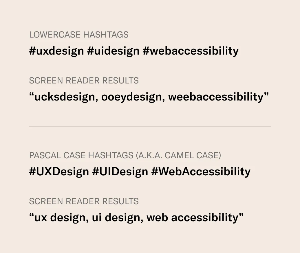
I made this graphic to help illustrate how screenreaders read hashtags, comparing lowercase and pascal case:

When conjoined words are in lower case, screen readers will attempt to read them as single words. They basically read them phonetically, which yields some interesting results (as outlined above).
On my original post, a lot of people asked a lot of the same questions about different types of hashtags and how they are implemented. I have answers:
- Should hashtags be grouped at the end of a post or is it okay to add hashtags to words inline? Screen readers will treat them the same either way. Some people using screen readers say that they’d rather avoid long groups of repetitive words at the end of a post. Others feel it’s distracting to read them inline. A good rule of thumb is to only use them sparingly inline. But try to avoid conjoined-word hashtags inline. It’s awkward to read something like “everyone wins with #WebAccessibility.”
- Is it necessary to capitalize single words? No. But if you’re someone like me with OCD, you’ll find the inconsistency to be troublesome. Subjectively, it looks nicer to capitalize them all. But if you’re using a single-word hashtag inline, keep it lowercase unless it‘s a proper noun.
- What about branded words? This is more complex, but as a rule of thumb it’s okay to capitalize branded words as they are. Screen readers seem to do really well with hashtags like “iOS,” “MacBook,” and “FedEx.” They read them like we do. So a hashtag like “iOSDesign” will be read as “iOS design.” A strict pascal case version of “IosDesign,” for example, yields inconsistent results, which can be read as “eye ohs design.”
Accessibility for everyone
Pascal case hashtags are vital for people using screen readers, but the benefits don’t stop there. People with dyslexia, for example, have a hard time reading conjoined-word hashtags in lowercase. Many people with dyslexia weighed in with support for pascal case.

But accessibility isn’t just about disabilities. Even those of us with the privilege of sight and neurotypical brains will find value in pascal case hashtags because they’re simply more readable. Countless people said they already use pascal case because it simply reads better.

It’s far easier to scan/read “ThisHashtagIsLongButNormal” than “thishashtagislongbutnormal.” And this is especially true for people who are reading in their non-native language. The capitalization provides clear word segmentation to make things easier for everyone to read.
But the impact isn’t limited to reading speed. Hashtags with conjoined words can also be misinterpreted.
Back in 2013 people were using the hashtag “nowthatchersdead” in posts about the death of Margaret Thatcher. They were intending for people to read this as “now Thatcher’s dead.” But because people were using lowercase, many Cher fans were distraught, reading it as “now that Cher’s dead.”
The onus is on software makers to find a way
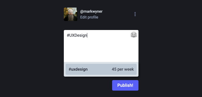
Most people agree that it “just makes sense.” But lots of people noted that it’s hard to use pascal case for hashtags because web/app UIs default to lowercase with autosuggest features.

People said they would “try harder” and “try to remember.” This shows us that adoption of pascal case formatting could be limited to only those who are committed. So it’s the systems that need to evolve.
Software and website builders should make a concerted effort (with or without AI) to find methods of detecting multi-word hashtags and converting them to pascal case in autosuggestion menus. This would result in effortless adoption by people publishing content online.

It’s also completely possible. Some developers pointed to various systems that already do this. One example is iOS, which produces pascal case hashtags when using text-to-speech. I didn’t know this until someone mentioned it, but I verified it to be true. And the system is really good at using the right capitalization.
Other formats
Interestingly, a handful of people asked about using other types of cases. Most notably snake case and kebab case.
Snake case uses lowercase letters with underscores in place of spaces. This format is useless because screen readers will pronounce the underscore. So “web_accessibility” will be read as “web underscore accessibility.”
Kebab is the same as snake case except that it uses hyphens instead of underscores. Screen readers will actually ignore the hyphens, reading only the words. But hyphens can cause issues on the development side of things. In fact, some systems won’t even allow them. So it’s better to simply avoid kebab case.
Just be kind: use accessible hashtags
Accessibility has been front of mind for me throughout my career. It’s simply an inherent part of everything I design/build. And I’ve literally had to debate with my clients and employers about its importance and relevance.
Those fights come less frequently and with less friction these days, but education around these topics is still vital. Too many people don’t realize how some of the smallest accommodations make a world of difference for others. Especially for those who experience life through a disadvantaged lens. And when we accommodate for accessibility, we make the web better for everyone.
I welcome feedback on this if you’ve had conflicting experiences. I’d love to make updates for posterity. Because I don’t know everything, I just know some things.
