Holistic Bill-Pay Design for Healthcare
Good design is holistic. It considers the journey your audience is on well before they ever interact with your product. It guides them from start to finish, even if your product only touches the center of that path. It also means understanding their emotional state, which in turn impacts their mental state. And their level of tolerance for whatever UX you’re about to put in front of them.
Take, for example, the process of paying a bill. For most people, bills tap into finite resources. When they can be paid, the process often triggers anxiety or despair. People pay bills because they have to, not because they want to. As designers, we have an opportunity to reduce the friction of that task. And that’s what Providence Healthcare has done with their bill pay.
Every time I have to pay my bill, I’m grateful for their system. So I thought I’d share it as a case study on how to do it well.
The System
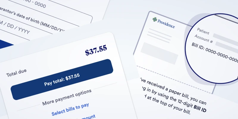
The authentication screen doesn’t ask you to create or log-in to an account. It only asks for a bill ID and the guarantor’s date of birth. And what makes this so easy and stress free is the graphic they include adjacent to the form. It literally shows you where you can find the ID on your bill.
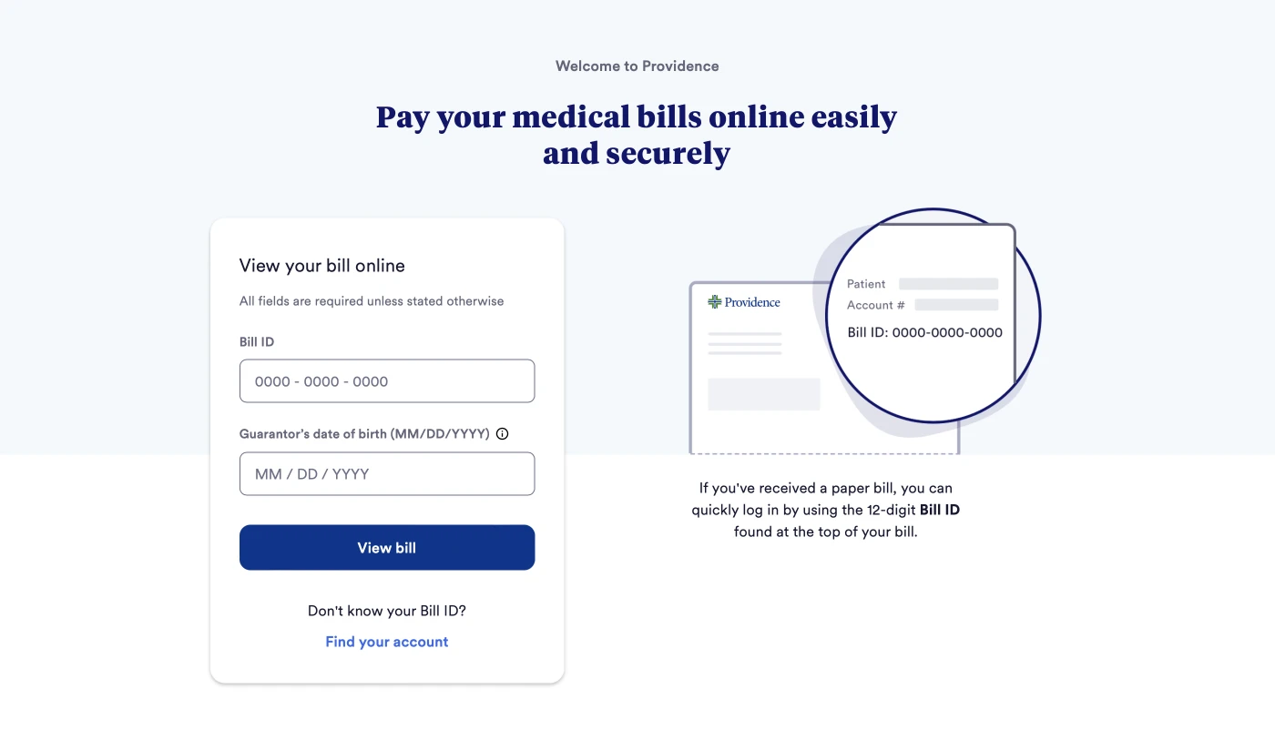
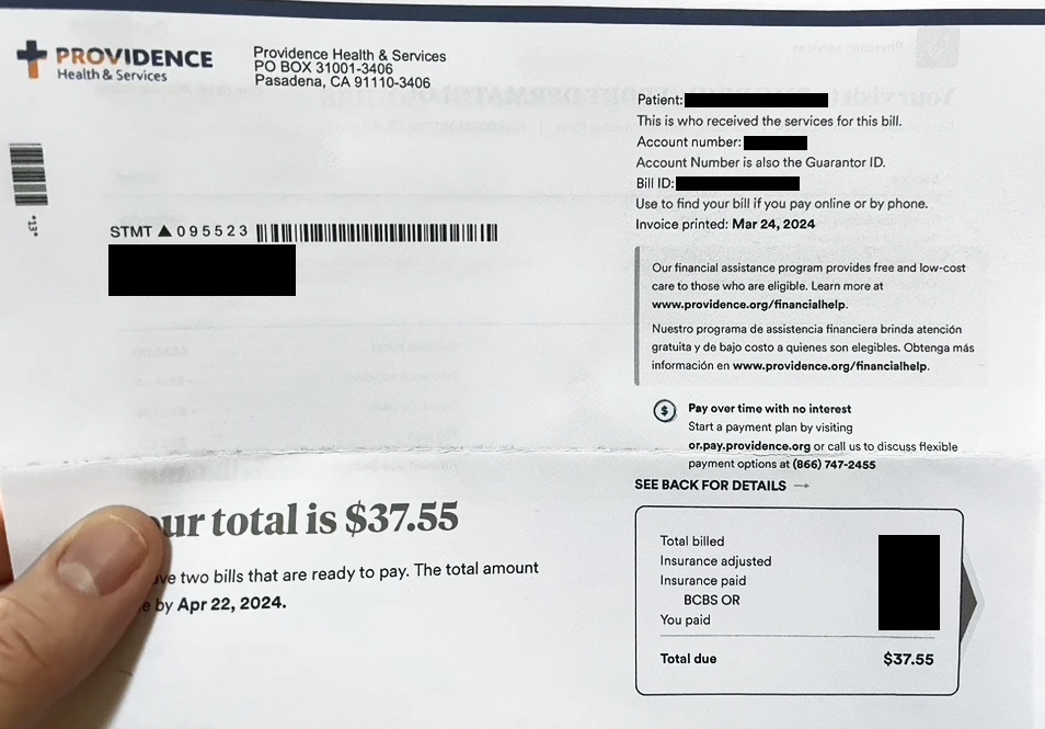
They tell you it’s 12 digits, symbolically magnify the upper-right corner of the bill, and show you that it’s directly after “patient” and “account number.” Which it quite literally is.
So retrieving a bill takes two pieces of information, one that’s very easy to find (bill ID) and the other you’ll already know (birth date).
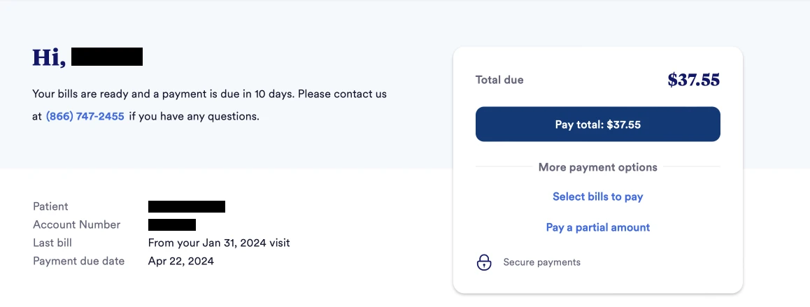
Once the bill has been retrieved and displayed, everything is simple and easy to see. A large (and friendly) greeting with a name confirms you’re in the right place. Only pertinent information is displayed, including a prominent phone number if help is needed. The amount due is amplified and visually mirrors the number on the paper bill (including a matching font), making it easy to confirm the total.
The payment process is quite easy, and begins with a very prominent button to get started. This CTA reiterates the amount due and is directly followed by other payment options.
The designers of this process clearly went beyond designing a series of bill retrieval and payment views. They considered how a holistic UX might help people through a potentially stressful task. One that begins well before they ever come into contact with the payment system: upon bill receipt.
Now that’s holistic design.