Mark W.rites

Posts in #UX

Three UX Laws That Optimize Information Seeking
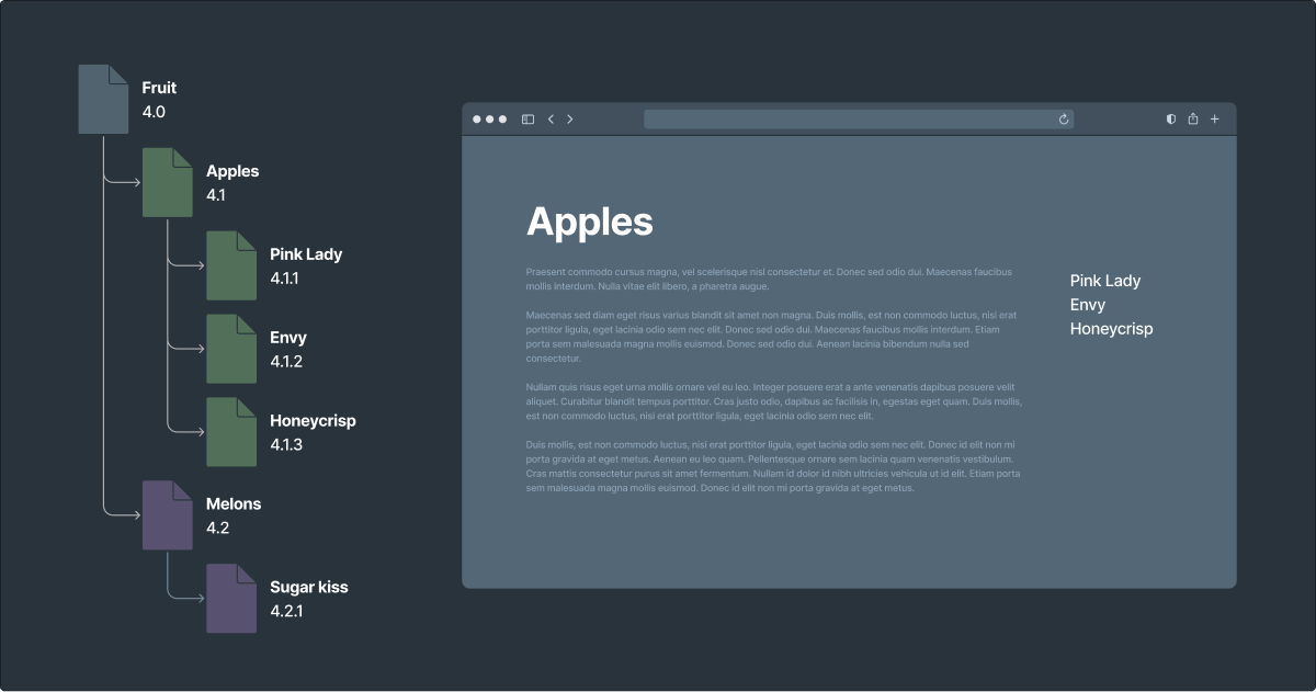
Information architecture outline aside an illustration of a web page. The outline shows a parent of fruit with two children: apples and melons. The apples branch has three children: Pink Lady, Envy, and Honeycrisp. The melons branch has one child: Sugar Kiss. The web page illustration shows a long passage of fake content with a headline that reads 'apples.' A sidebar shows three navigation items from the apples branch of the outline.

The fundamental purpose of information architecture is to enable efficient information retrieval. We accomplish this with meaningful information structure and intuitive labels. And we bring them together with sensible navigation design.

Read more…
Approaching the Complexities and Nuances of Automotive UX

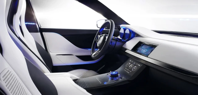
The front cabin of a futuristic concept car. It's mostly white with electric blue lights near the dashboard, console, and manual controls.
Concept car for Jaguar

UI design takes on an entirely different meaning when the UX doesn’t include a screen. That’s a lot of what automotive UX/UI design is all about.

In the early years of my career, every user experience I was designing comprised a single modality and a single visual UI. As my career progressed, I was able to work on an ever-expansive ecosystem of modalities, including products with smaller UIs, and even without UIs at all.

Read more…

Holistic Bill-Pay Design for Healthcare

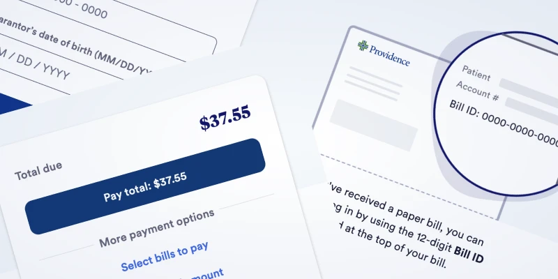
Collage of segments from bill-pay designs explained in this article.

Good design is holistic. It considers the journey your audience is on well before they ever interact with your product. It guides them from start to finish, even if your product only touches the center of that path. It also means understanding their emotional state, which in turn impacts their mental state. And their level of tolerance for whatever UX you’re about to put in front of them.

Read more…

Easy Solutions for 5 Very Common UX Mistakes

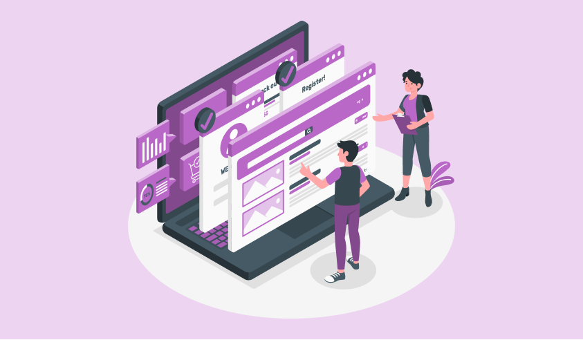
Illustration by Storyset. It’s a wall of layered UIs with two nicely-dressed people looking at and discussing them.

I’ve been designing and using digital interfaces for well over two decades. In that time I’ve seen a handful of mistakes that we keep making, over and over again. They’re the UX faux pas that I love to hate. 5 of them, in particular, are especially egregious. Let’s avoid all of these at all times.

Read more…

ESPN’s Simple and Honest UX for Digital Subscriptions

Looking down at an antique Favorit typewriter with a piece of paper sticking out of the top of it.

One of the most prominent dark UX patterns is hiding paths to exit doors. Faint unsubscribe links, ambiguous language, and even forcing people to call a phone number to opt-out of digital products. The intention is the same every time: retain customers.

Read more…

Automobile Makers are Trying to Kill Us with Touchscreen Dashboards

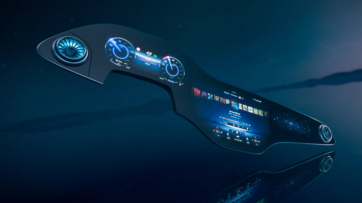
Graphical representation of a full automobile dashboard with a continuous screen from driver side to passenger side, with driving controls on the left, media and climate controls in the middle, and a graphic of a galaxy on the right.
The forthcoming MBUX Hyperscreen, via Mercedes-Benz.

Back in 2013 I gave a talk about design usability which included a slide about the then-new Tesla touchscreen dashboard. Everyone was super hyped about how cool it was, but I was there to ruin the party with my criticism about a lack of tactile feedback.

Read more…

What My Father’s Unironic Rampage About The Hulk in a Toy Store Taught Me About UX Design

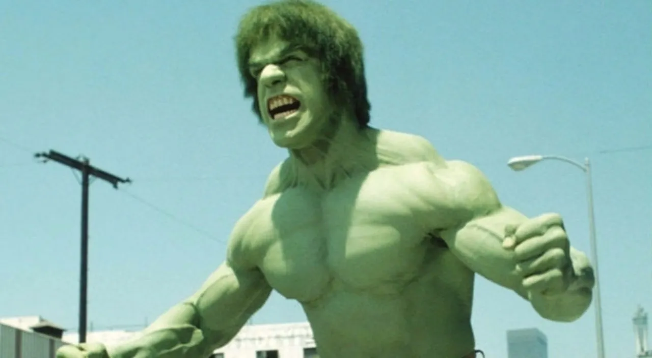
Lou Ferrigno as the Hulk from the 70s TV series with his arms raised while flexing his muscles and growling.
That’s Lou Ferrigno, not my father.

I think I was six, which would have made my brother four. We were avid fans of The Hulk TV series, starring Lou Ferrigno. My dad, like most 70s dads I suspect, had a crush on Lou because he was manly and buff. For my brother and me, though, we just loved that he was green, wore purple pants, and beat the shit out of bad guys for doing bad things.

Read more…