Approaching the Complexities and Nuances of Automotive UX
UI design takes on an entirely different meaning when the UX doesn’t include a screen. That’s a lot of what automotive UX/UI design is all about.
In the early years of my career, every user experience I was designing comprised a single modality and a single visual UI. As my career progressed, I was able to work on an ever-expansive ecosystem of modalities, including products with smaller UIs, and even without UIs at all.
UX for these new modalities is quite complex. And fun.
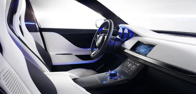
About ten years back I spent the better part of two years working with a brilliant team on an in-vehicle infotainment (IVI) system for an automobile client (NDA: one of the “big three”).
The overall goals of this project were to:
- Conduct generative research on the target audience
- Explore features and technologies necessary to fulfill the needs/desires of that audience
- Conduct evaluative research and usability testing with a partial prototype.
Our research and test results would help inform the client about which features would be both meaningful and successful in their automobiles.
Crafting scenarios and a user journey
We began by defining a number of scenarios that would help us build a set of prospective features. Those scenarios were then compiled into a journey that spanned a typical day in the life (relevant to the target audience).
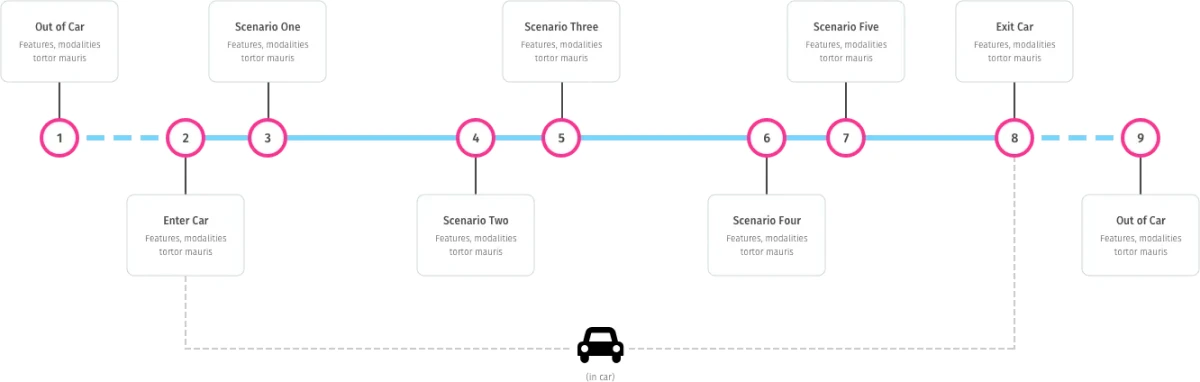
While building the journey map we realized we would face a number of considerations. Three in particular garnered a lot of our attention throughout the project:
- Finding the right balance of control between driver and automobile (and its IoT autonomy)
- Working with an array of connected modalities (aural, visual, and haptic)
- Understanding and accommodating cognitive load while driving
It was so much fun working through these considerations. This is how we did it…
Balancing control between driver and automobile
First, we needed to decide who would be in control. Did people want a partner or a manager? Autonomy or dependency? An anticipatory or reactionary system? Did people even want their automobiles outsmarting them?
A great way to answer these questions was to use familiar metaphors to help us understand the relationship between driver and car, and ultimately the level of control a driver has. We gave the metaphors agency, which is essentially personas, complete with names and avatars.
Let’s look at how two agents — a dog and a butler — helped us compare two types of user experiences.
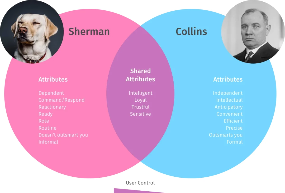
With these agents we were able to explore two very different relationships for the overall UX, with a focus on a balance of control. The dog would be reactive and would learn on the go. This would make the training process easier but longer. The butler, on the other hand, would be anticipatory. This would be more thorough, but would require a deeper level of intimacy, which could breach the comfort of privacy.
Accommodating multiple modalities for input and output
With a journey map and agents in place, we could begin to explore potential interactions between driver and automobile. This would require taking inventory of input/output modalities, then connecting the dots between them.
In this case, we looked at inputs like mobile devices, wearables, sensors, internal controls voice, and even IoT inputs like GPS and external infrastructure-systems. Outputs might be visual displays (including a Heads-Up Display, or “HUD”), haptic feedback, aural cues, mechanical devices, and environmental systems (light, temperature, etc.).
Every scenario presented myriad challenges, each requiring us to define the source of input and the method of feedback. The perfect activity for this was “How Might We?” (HMW). This is one of my favorite UX activities because everyone can be involved and it yields rapid results.
Let’s look at how this works using a scenario when a drawbridge disrupts a mapped trip. We would begin by generating a number of HMW questions around the scenario:
- “HMW alert the driver before she sees the obstacle?”
- “HMW know about a bridge draw in advance?”
- “HMW help the driver reroute mid-trip?”
With a list of questions for each scenario, we could begin mapping out input/output modalities. As we worked through the scenarios we were able to build models for use across the multiple modalities, including the four visual displays. This set a foundation for a didactic UX that would dramatically reduce a driver’s cognitive load.
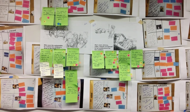
Storyboarding and usability testing
Usability research would be a critical step in assessing how our features would be received by the target audience. It was too early to build a prototype, but storyboards would help people visualize each scenario on the journey map.
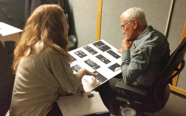
Our facilitator walked participants through our storyboards, one for each of our two final agents. The goal being to help participants see themselves in a role with an automobile. Their reactions helped us understand which features and what agent would be most appropriate.
Crafting a dimensional prototype for testing cognitive load
We now had a pretty solid understanding about where we could go with our IVI system, and were ready for our journey to be realized as a working prototype. We wanted to test the features in a simulated driving experience, to see how the UX would hold up with a high cognitive load. The prototype would need to guide participants through a realistic journey, disruptions and all.
We used a virtual world from a Unity game environment to emulate the view through a windshield. We then mapped out a predefined path through a city that would enable us to fully realize our entire journey, introducing characters and other environmental variables as necessary. Participants were seated within a virtual automobile cabin, complete with a steering wheel, pedals, and four visual displays.
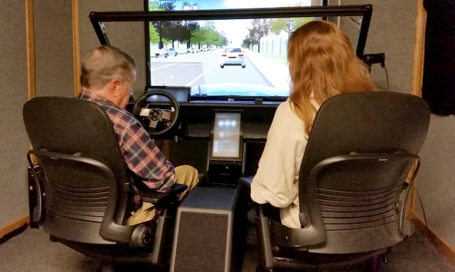
Our facilitator sat in the passenger seat and helped guide the test drivers through the journey we created with our timeline. Their attention was divided between real-world driving factors (other drivers, pedestrians, traffic signals, etc.) and scenario-prompts from our system (music, phone calls, traffic alerts, etc.).
While this environment was a simulation, it had the necessary components to help participants get a feel for using our features while driving. This was far more realistic than storyboards, wireframes, or even a single-screen experience. We learned a lot from these sessions, and our findings guided us deep into confident recommendations for the full IVI system.
Conclusion
Designing for an automobile environment was quite complex. Not only did we need to consider multiple connected-modalities, we needed to contend with cognitive load, which is amplified while driving. Understanding the relationship between driver and automobile was a critical factor in finding the right overall balance throughout.
While there are many ways to approach a project like this, our approach proved to be successful. The client was thrilled to have a thorough research package to use in the design of their new systems. Our team also learned a lot en route (pun intended).
Some of the data in these images was modified/cloaked to honor an NDA. An early version of this article was originally published to the Optimal Workshop blog in advance of my talk on voice-based UX systems at UX New Zealand 2017.
#Research #UX #Design #Usability #UsabilityTesting #Automotive #IVI #Infotainment #Cognition #Psychology
Like this? Find out when I publish new work.