In 1978, Matthew Carter designed the typeface Bell Centennial. It was a special typeface, built for a unique set of goals. What manifested was an adaptable typeface that tackled the printing challenge of “dot gain.”
The fundamental purpose of information architecture is to enable efficient information retrieval. We accomplish this with meaningful information structure and intuitive labels. And we bring them together with sensible navigation design.
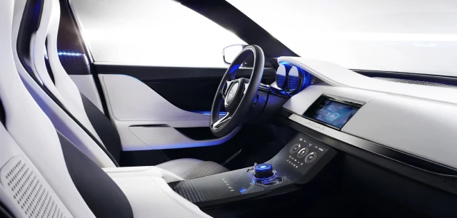
UI design takes on an entirely different meaning when the UX doesn’t include a screen. That’s a lot of what automotive UX/UI design is all about.
In the early years of my career, every user experience I was designing comprised a single modality and a single visual UI. As my career progressed, I was able to work on an ever-expansive ecosystem of modalities, including products with smaller UIs, and even without UIs at all.
Good design is holistic. It considers the journey your audience is on well before they ever interact with your product. It guides them from start to finish, even if your product only touches the center of that path. It also means understanding their emotional state, which in turn impacts their mental state. And their level of tolerance for whatever UX you’re about to put in front of them.
I’ve been designing and using digital interfaces for well over two decades. In that time I’ve seen a handful of mistakes that we keep making, over and over again. They’re the UX faux pas that I love to hate. 5 of them, in particular, are especially egregious. Let’s avoid all of these at all times.
Well-intended product design can turn into a usability/accessibility nightmare. Something as simple as a button can be marked up with HTML/CSS in myriad ways. We can make sure it’s done properly with a sensible markup.
Two weeks ago a small publisher sent me an email about the book I'm writing. They asked what it was about. I responded with a synopsis and a link to the talk I've been giving which is the foundation for it. It’s about exclusivity and biases in design.
While there are many reasons to make a product accessible, the most important is simply because it’s the right thing to do. But you may have a client, team, or boss who doesn’t see the value. It’s absurd that we even have to sell accessibility, but often we do. If this is your world, I got you (complete with resources, below).
I think I was six, which would have made my brother four. We were avid fans of The Hulk TV series, starring Lou Ferrigno. My dad, like most 70s dads I suspect, had a crush on Lou because he was manly and buff. For my brother and me, though, we just loved that he was green, wore purple pants, and beat the shit out of bad guys for doing bad things.