On November 10, 2014 I published my first article on Medium. I had published other pieces elsewhere, but it was my first on this new-to-me platform. It was also the first time I published my own work instead of writing for publications.
The fundamental purpose of information architecture is to enable efficient information retrieval. We accomplish this with meaningful information structure and intuitive labels. And we bring them together with sensible navigation design.
Clara de la Rocha on the left, Princess Leia on the right
On May 25th, 1977, the world met Star Wars, a film that changed science fiction forever. Go back nearly a century—to 1890—and a much smaller world met Clara de la Rocha, a woman who changed Mexico forever. And Princess Leia brought them together. At least according to George Lucas.
Apollo 11 astronaut Buzz Aldrin’s footprint on the moon (one of the first)
If you have a debit card and around $35 you can purchase an extraterrestrial acre of land. Online. Deeds are available for plots on Mercury, Venus, Mars, Lo, and Titan. If you want something a little closer, lunar plots are also available.
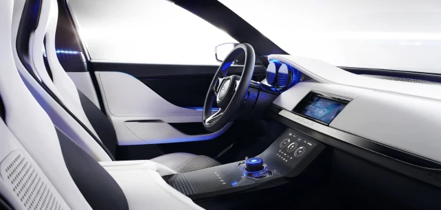
UI design takes on an entirely different meaning when the UX doesn’t include a screen. That’s a lot of what automotive UX/UI design is all about.
In the early years of my career, every user experience I was designing comprised a single modality and a single visual UI. As my career progressed, I was able to work on an ever-expansive ecosystem of modalities, including products with smaller UIs, and even without UIs at all.
Good design is holistic. It considers the journey your audience is on well before they ever interact with your product. It guides them from start to finish, even if your product only touches the center of that path. It also means understanding their emotional state, which in turn impacts their mental state. And their level of tolerance for whatever UX you’re about to put in front of them.
To-do lists can be as overwhelming as they are helpful. But it feels so good to check something off. Always. If I accomplish a task that isn’t on my list, I will literally add it only to immediately cross it off. Why? Because it helps me feel a sense of accomplishment. And because it’s an accommodation for my OCD.
I’ve been designing and using digital interfaces for well over two decades. In that time I’ve seen a handful of mistakes that we keep making, over and over again. They’re the UX faux pas that I love to hate. 5 of them, in particular, are especially egregious. Let’s avoid all of these at all times.
Well-intended product design can turn into a usability/accessibility nightmare. Something as simple as a button can be marked up with HTML/CSS in myriad ways. We can make sure it’s done properly with a sensible markup.